
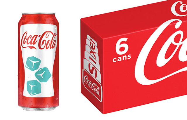
There are two types of problems that designers try to solve: problems people have, and problems designers delude themselves into thinking people have. Venerable sugar tonic maker Coca-Cola has just released a new can design firmly in the latter camp: a chill-activated can to visually tell people whether their Coke is cold or not. First released as a 7-Eleven promotion six months ago, the chill-activated can is now available to everyone.
Chill-activation, of course, is nothing new. The designers at MillerCoors have previously rolled out a series of chill-activated Coors Light cans, glasses, and containers. When refrigerated, the outline of the Rocky Mountains on the cans turn a vibrant blue, indicating that the can is properly cold. Coca-Cola is doing the same thing here, only color-changing ice cubes serve as the visual cue.
It's all innocuous enough, but with Coca-Cola getting in on the thermochromatic ink trolley, maybe it's time to call this what it actually is: faddish bad design.
It should be obvious, but for the most part, no one needs to be visually told when something is cold or hot. There are exceptions, of course: an electric stove burner that turns orange when it's hot is an important safety cue. But when safety is not a factor--and a lukewarm can of pop is not going to kill anyone--a can that shows you when it is cold is like a siren that goes off when it's bright out. It's self-evidently absurd. We don't expect to "see" cold. We expect to feel it, and our skin has been designed to do just that. When we want to know if a can of Coke is cold, or a pizza is warm, our natural instinct is to touch it. That's what our hands are for.
The design problem that Coca-Cola, Coors Light, Mountain Dew, Pizza Hut have tasked themselves to solve is how to convey the temperature of their product to people without hands. That's actually a noble pursuit in its own way--amputees need a nice frosty one now and again, just like everyone else--but something tells me, that's not why these companies' R&D departments spent their millions.
No comments:
Post a Comment